
How to Use Heatmaps to Improve Your Website’s Design
Have you ever wondered why some websites feel easy to use while others leave you frustrated? The secret often lies in how well the website is designed. One powerful tool that helps designers and website owners create better user experiences is heatmaps. Heatmaps show you where people click, scroll, and focus on your website. By understanding this data, you can make smart changes to improve your site’s design.
We are about to explain what heatmaps are, how they work, and how you can use them to make your website more user-friendly. Whether you’re a beginner or an experienced website owner, this guide will help you get started with heatmaps.
Key Takeaways
- Heatmaps show where users click, scroll, and spend time on your website.
- They help you identify what’s working and what’s not in your website design.
- Common types of heatmaps include click maps, scroll maps, and attention maps.
- Use heatmaps to fix design problems, improve user experience, and increase conversions.
- Tools like Hotjar and Crazy Egg make creating and analysing heatmaps easy.
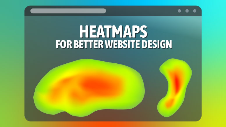
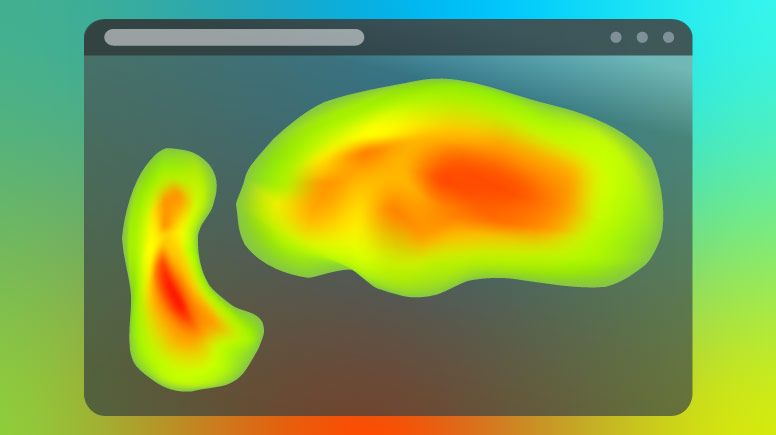
What Are Heatmaps?
A heatmap is a visual tool that uses colours to show data. On a website, heatmaps use warm colours (like red and orange) to show areas that get a lot of attention and cool colours (like blue and green) for areas that get less attention.
For example, if many people click on a button, it might appear red on the heatmap. If a section of your page is rarely scrolled to, it might appear blue. This makes it easy to see what’s working and what’s not.
Heatmaps are especially useful because they provide a visual representation of user behaviour. Instead of relying on guesswork or assumptions, you can see exactly how users interact with your site.
Types of Heatmaps
There are three main types of heatmaps you should know about:
Click Maps
-
- Show where users click on your website (desktop and mobile).
- Help you identify popular links, buttons, or elements that users interact with.
Scroll Maps
-
- Show how far users scroll down a page.
- Help you understand if important content is being seen or ignored.
Attention Maps
-
- Show where users spend the most time looking.
- Help you identify which parts of your page grab attention.
Each type of heatmap provides unique insights. For example, click maps are great for understanding user interactions, while scroll maps help you optimize content placement.
Why Heatmaps Matter for Your Website
Heatmaps give you insights into how real users interact with your website. Instead of guessing what works, you can use data to make informed decisions. Here’s why heatmaps are so useful:
- Find Design Flaws: If users keep clicking on something that isn’t clickable, it’s a sign your design is confusing.
- Improve User Experience: By understanding what users focus on, you can make your site easier to navigate.
- Boost Conversions: Heatmaps can help you place important buttons or links where users are most likely to see them.
Heatmaps also help you understand user behaviour across different devices. For example, mobile users might interact with your site differently than desktop users. By analyzing heatmaps, you can create a design that works well for everyone.
How to Use Heatmaps to Improve Your Website
Now that you know what heatmaps are, let’s talk about how to use them to improve your website.
1. Identify Unclickable Elements That Users Click On
Sometimes, users click on things that aren’t clickable, like images or text. This can be frustrating for them. A click map will show you these areas. Once you know where users are clicking, you can either make those elements clickable or redesign the page to reduce confusion.
Example: If users keep clicking on a non-clickable image thinking it’s a button, you can turn it into a clickable link.
2. Check If Important Content Is Being Seen
A scroll map will show you how far users scroll down your page. If important content is below the fold (the part of the page you see without scrolling), users might miss it.
Example: If your call-to-action button is at the bottom of the page but most users don’t scroll that far, move it higher up.
3. Optimize Button Placement
Heatmaps can show you where users naturally click or focus. Use this data to place buttons, links, or forms in high-engagement areas.
Example: If users often click on the top-right corner of your page, consider placing your “Sign Up” button there.
4. Test Different Designs
Heatmaps are great for A/B testing. Create two versions of a page and use heatmaps to see which one performs better.
Example: Test two different layouts for your homepage. Use heatmaps to see which layout gets more clicks on your main call-to-action.
5. Improve Mobile Usability
Heatmaps can show you how users interact with your site on mobile devices. This is important because mobile users often behave differently than desktop users.
Example: If mobile users struggle to click a small button, make it larger and easier to tap.
6. Analyze User Engagement
Attention maps can help you understand which parts of your page grab the most attention. Use this data to highlight important information or remove distractions.
Example: If users spend a lot of time looking at a specific section, consider adding a call-to-action there.
Tools to Create Heatmaps
There are many tools available to create heatmaps, but choosing the right one can be tricky. For a detailed breakdown of the best heatmap tools read our comprehensive guide here.
Here’s a comparison table of popular heatmap tools to help you choose the right one for your needs:
| Tool | Key Features | Best For |
|---|---|---|
| Hotjar | Click maps, scroll maps, session recordings, feedback polls | Beginners and small businesses |
| Crazy Egg | Click maps, scroll maps, A/B testing, user recordings | E-commerce and conversion optimization |
| Microsoft Clarity | Click maps, scroll maps, and session recordings (free) | Budget-conscious users |
| Lucky Orange | Click maps, scroll maps, live chat, session recordings | Real-time user interaction tracking |
How to Interpret Heatmap Data
Interpreting heatmap data can seem overwhelming at first, but it’s easier when you break it down into steps:
-
Look for Patterns: Are users clicking on the same areas repeatedly? This could indicate a popular feature or a design flaw.
-
Identify Dead Zones: Areas with little to no interaction might need redesigning or removing.
-
Compare Desktop and Mobile: User behaviour often differs between devices. Make sure your design works well on both.
-
Combine with Other Data: Use heatmaps alongside analytics tools to understand the “why” behind user behaviour.
Real-World Example: How Heatmaps Improved a Website
Let me share a quick story. A friend of mine runs an online store. He noticed that sales were low, even though traffic was high. He used a heatmap tool and discovered that users were clicking on a product image, expecting it to lead to more details. But the image wasn’t clickable.
After making the image clickable, sales increased by 20%. This small change made a big difference because it improved the user experience.
Another example is a blog that noticed users weren’t scrolling past the first few paragraphs. By analyzing their scroll map, they realized the content was too dense. They broke it into smaller sections with subheadings and images, which increased engagement.
Common Mistakes to Avoid
While heatmaps are powerful, they can be misleading if not used correctly. Here are some common mistakes to avoid:
- Ignoring Mobile Users: Always check heatmaps for both desktop and mobile users.
- Not Testing Long Enough: Heatmap data needs time to be accurate. Don’t make changes based on a small sample size.
- Overloading Your Page: Adding too many elements based on heatmap data can make your page cluttered.
- Ignoring Context: Heatmaps show what users do, but not why. Combine heatmap data with user feedback for better insights.
Advanced Tips for Using Heatmaps
If you’re ready to take your heatmap analysis to the next level, here are some advanced tips:
Segment Your Data
-
- Analyze heatmaps for different user groups, such as new visitors vs. returning visitors.
- This can help you tailor your design to specific audiences.
Combine Heatmaps with Other Tools
-
- Use heatmaps alongside tools like Google Analytics to get a complete picture of user behaviour.
Track Changes Over Time
-
- Regularly review heatmaps to see how user behaviour changes after you make design updates.
Focus on High-Traffic Pages
-
- Start by analyzing pages that get the most traffic. This will give you the biggest impact on your efforts.
Your Next Steps
Heatmaps are a simple yet powerful way to understand how users interact with your website. By using this data, you can make smart changes that improve user experience and boost conversions.
Ready to get started? Sign up for a free trial of Hotjar or Crazy Egg and create your first heatmap today.
Frequently Asked Questions
1. What is a heatmap?
A heatmap is a visual tool that uses colours to show where users click, scroll, or spend time on your website.
2. Are heatmaps easy to use?
Yes, most heatmap tools are user-friendly and don’t require technical skills.
3. Can heatmaps work on mobile devices?
Yes, many heatmap tools offer mobile-specific data to help you optimize for mobile users.
4. How long should I test before making changes?
It’s best to collect data for at least a week to ensure your results are accurate.
5. Do heatmaps work for all types of websites?
Yes, heatmaps can be used for blogs, e-commerce sites, portfolios, and more.
By following these tips and using heatmaps, you can create a website that’s not only beautiful but also easy to use. Happy designing!
LEAVE A COMMENT


0.1222