10 Essential Things to Keep in Mind When Designing a Logo
A great logo will enable your brand to stand out and be instantly identifiable. In this modern digital era of increasing competition amongst businesses, your logo is a key player in gaining the attention you need.
From drafting your logo on paper to having it printed on large billboards, here are ten essential aspects of logo design that need to be considered along the way.
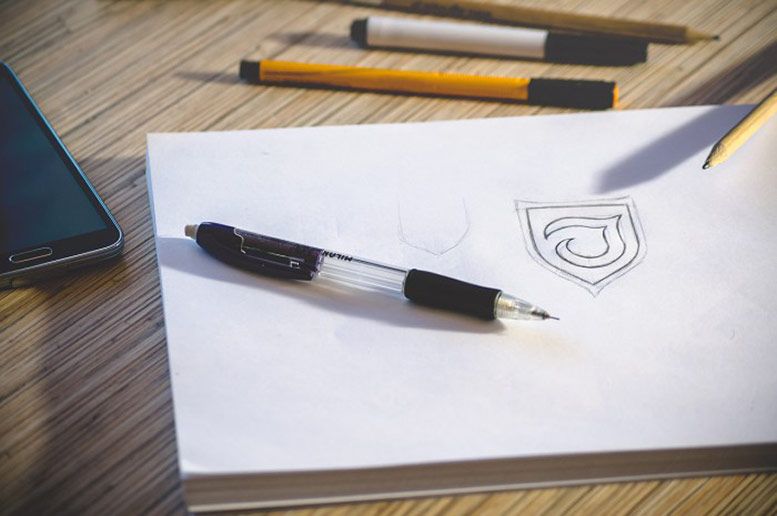
1. Put Pen to Paper
There is a lot to be said for the good old-fashioned way of putting your ideas and design concepts down on paper. It may be one of the most time-consuming aspects of creating a simple logo but rushing ahead with the design will compromise the final result. As you start with preliminary sketches, you will see your drafts branching out into improved variations of your original idea.
2. Express Yourself
Your logo's colours, shape, and typography should give an immediate image of who you are or what your business is all about. Think of the Arrow in the FedEx logo or the A to Z of Amazon.
3. Your Audience
Whether you choose a wordmark logo or one combined with an image, it should reach out to your target audience. For example, when offering a product or service targeted at children, you would use playful and fun imagery.
4. Make a Statement
Gain recognition with a successful logo design that speaks for itself. Captivate your audience visually with a bold and appealing image that sells your product or service and leaves a lasting first impression.
5. Think Outside the Box
Dare to be different. Take a look at Apple’s logo, as it is a great example, it’s unique and memorable and they have gone for using a symbol that is completely different and not computer related.
6. Simplicity
A simple, striking logo design will be easy on the eye and legible in all sizes. Steer clear of overcrowded designs and start by scaling your logo to the size it will be on your business cards and letterheads. If it loses definition, it will not be as effective.
7. Adaptability
A logo in vector format will have the functionality to be enlarged and printed on larger forms of media such as shop fronts and billboards, without compromising on the quality of the image.
8. Colour
There is great importance placed on the colours that you choose for your logo. They will define the entire colour scheme for your website and beyond. Using a colour wheel tool is important for choosing the shades that go well together. Also, take into consideration how good your logo will look in black and white and greyscale.
9. Typography
You may want to play around with several font types before finally settling for the one that suits your logo or tagline the most. For a professional image, use no more than two different fonts and avoid the commonly used ones such as Comic Sans which will make your image look amateur.
10. Research
Research is a vital element of design, for example, if you wanted to create a design concept for a Moroccan restaurant, then it would be a good idea to take a look at what some of the cuisines look like, what type of pots and utensils are commonly used in that region, then incorporate those into your design.
Keeping these critical points in mind will help you even if you decide to have your logo created by a professional graphic designer, who will be able to design your logo with the functionality to work across all forms of media from your website to your shop signs and posters.
Feel free to communicate your preferences with your designer and contribute any drafts of what you have in mind. At WebYurt.com we are happy to help with all your logo design requirements.
If you need to outsource graphic design projects then look no further than BackOffice Pro.




COMMENTS
Your all 10 points appears a very essential set of guideline to help proceed a serious self-critic amateur like me towards making an entry into the domain of highly qualified.
Thanks so much for writing a guide that covers all the things you don't think about until you're deeply involved in creating. Creating a website years back, I spent hours trying to get the site to look correct. I never did get it right. After reading this guide, I see where I made a lot of mistakes. I'm looking forward to creating my brand differently this time. The advice within these sections actually has me looking forward to the future for my online store. I was dreading it before I found this guide. Very inclusive and complete! Thank you so much for taking the time to share your successes and failures.
It is always a matter of creativity that you have to think out of the box to make stunning designs, I am happy to see that people are focusing on the logo designs.