

The Psychology of Colour in Web Design: Influencing User Behaviour
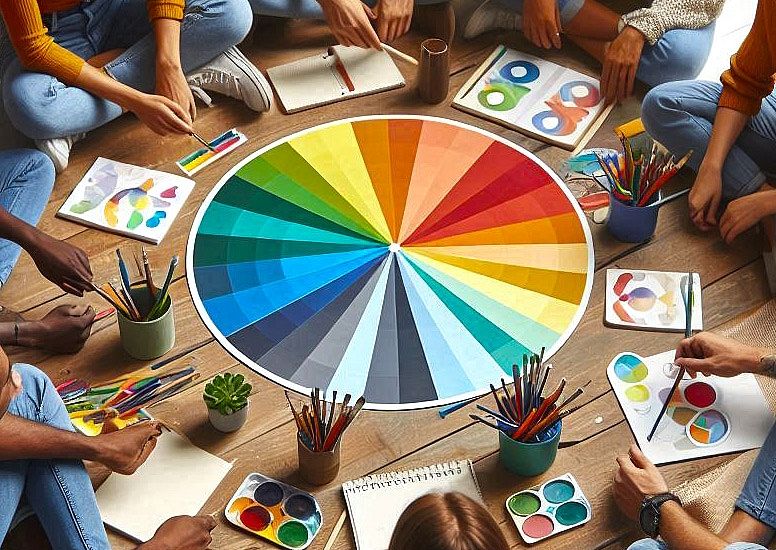
Colours in web design do more than look good. They shape emotions and actions without users realizing it. Understanding colour psychology gives designers a powerful tool. Let's have a look at how colours influence online experiences.
We'll examine how colour choices guide visitors, increase engagement, and strengthen brand identity. You'll learn practical ways to use colour psychology for various website types, from online stores to professional services. We'll also examine how colour affects user behaviour across different industries.
How Colours Shape Emotions
Colours evoke different emotional responses, which savvy web designers can use to create specific user experiences. Warm tones like reds and oranges often spark feelings of urgency or excitement. These hues can be perfect for sale announcements or time-sensitive offers. Conversely, cool colours such as blues and greens inspire calm and trust.
This emotional mapping of colours finds practical application across various industries. Take optometrist marketing, for instance. Eye care websites often use soothing blues and greens to create a sense of trust and serenity.
This colour choice helps patients feel at ease, which is crucial when dealing with something as sensitive as eye health. By using calming colours, optometrists can create a digital environment reflecting their real-world practice's care and precision.
Guiding User Behaviour Through Colour
Website colours can direct visitors' attention and, essentially, their actions. Striking colours can be used on buttons, banners, and elements that are supposed to display important information. This greatly enhances the site's general usability.
It must be noted that CTA buttons are very important regarding the issue of colour. This is where bright and contrasting colours can potentially raise click-through rates. This is rather interesting from a psychological standpoint: some colours can evoke certain reactions in users without them even realizing it. For instance, an orange colour with a label of ‘Sign Up’ on a blue background can create a sense of urgency that will lead to people clicking the button.
It helps to emphasize the main components as they differ from each other. Thus, the contrast makes CTAs and other elements easy to notice and engage with. This also enhances the user experience and increases conversion rates since important actions are easily visible and easily accessible.
Cultural Nuances in Colour Perception
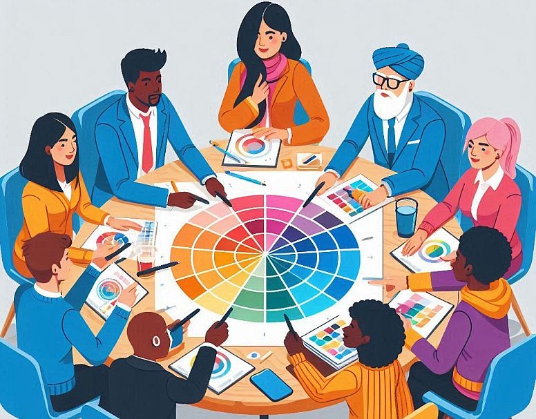
One must always consider that the perception of colour may change in different cultures. For example, in Western culture, white is considered a colour of purity, but in some cultures of the East, it is considered a colour of mourning and death.
A web designer who is designing for an international audience must consider this disparity. This is where a more considerate strategy is adopted: one has to look up the colours and their meanings in the target market and adapt the designs. This is an important cultural sensitivity in that it can define the success or failure of a website with a particular audience.
Establishing Brand Identity with Colour
Using colours as a means of communicating is one of the most viable marketing strategies. It can sustain brand awareness. Using the same colour scheme on your website and social media accounts can help a brand build a stronger and better brand image.
This continuity in using colours helps create brand awareness among consumers. The colours become synonymous with the brand, making them easily remember the brand even if they do not see the logo or the name. This psychological link between the colour and the brand can be advantageous when developing customer loyalty.
A Look into the Use of Contrast in Web Design

As with any other design element, colour is also governed by principles, one of which is contrast. Contrast assists in creating a visual flow, which leads users’ eyes to the areas that designers want them to focus on. Contrast can often be the key between a clear and understandable layout structure and a confusing one full of clutter.
Contrast is much more than mere aesthetics. It can improve the readability and clarity of the design. Texts with lesser contrast are hard to read or may not be read by users with visual disabilities. Thus, by focusing on contrast, designers can provide their content to many users with different needs.
The term contrast means more than just combining light and dark colours in real life. It entails assessing the connection of all aspects of a page, including the text, backgrounds of the image, and interactive features. The idea here is to develop an interface with a balanced design so that the most relevant information can be easily noticeable to the user.
Using colours on a website also does not only make the website look good. They can lead people, evoke emotions, and make people recall your brand. When you consider the matter of colours, you can find that your website will serve your business better.
Let’s have a look at the colour of your website. Are they the kind of feelings that you want to evoke? Are the important things easily accessible? Sometimes, minor colour changes can drastically affect the effectiveness of your site.
FAQs
What is the psychology of colours for websites?
Colours on websites can stir up users' feelings and reactions. Blue often makes people feel calm and trusting. Red can make them feel excited or make them feel that they need to act fast. Web designers use this to their advantage. They pick colours that fit what they want users to feel or do on the site. This can help keep users interested and make them more likely to buy things or sign up for services.
What are the three colour rules for websites?
The three-colour rule suggests using three main colours in your website design:
-
A main colour (60% of the design)
-
A secondary colour (30% of the design)
-
An accent colour (10% of the design)
What website colours attract the most?
Red, orange, black, and royal blue attract impulse buyers the most. These colours can create a sense of urgency or excitement that may encourage quick decisions. However, the best colours vary depending on your brand and target audience.
What are the four psychological colours?
According to colour psychologist Angela Wright, the four main psychological colours are:
-
Red: Affects the body
-
Blue: Affects the mind
-
Yellow: Affects emotions
-
Green: Brings balance
Each colour is thought to influence people differently, from their physical reactions to their mental state and feelings.
LEAVE A COMMENT


0.0707