Unleashing Brand New Ideas for Email Marketing Campaigns
2023 has been an eventful year for us as an email marketing company. Our inbox has witnessed a steady flow of gems from brands across the globe.
Speaking of “brand new ideas,” we have seen quite a number of those, albeit in a staggered manner, since few are new. Uniqueness is more a result of an instinctive outpouring of a team’s cognitive resources than a stiff-lipped decision at a boardroom catch-up.
Be that as it may, here are some of our favourite, inbox-wide customized email templates from various brands that we found quite fascinating.
(Note that we will talk more about creative implementation than just new ideas. Email is a delicate channel. It’s not meant for displaying avant-garde stunts.)
1. Imperfects
Our first template is from Imperfects, a noted apparel brand. The following template illustrates what we would call a per diem campaign.

Imperfect has rolled out a 12-day campaign called “12 Days of Deals.” We believe it’s a great way to keep the subscribers engaged. The best thing about this campaign is that you can send daily emails without annoying your subscribers. For 12 consecutive days, your audience expects a message from you – a golden opportunity for any brand.
2. The Bored Cow
Our next template is a quirky newsletter from The Bored Cow. Take a look, and you will see it’s nothing like your typical newsletter.

True to its brand identity, the newsletter embodies its emails' bold, comic sparkle. Instead of straight lines, fun arches divide the content blocks. The newsletter brings together gifting, product launches, recipes, and social responsibility in a single tight-knit template.
Indeed, if you never come across a newsletter that entertains as well as informs, this would be your Share this Email moment. The template expands the potential of newsletters.
3. Mount Sapo
Our third example illustrates what we call defocused marketing. Defocused marketing may be defined as a form of marketing that spotlights the corners of a brand, rather than the brand itself. Now what do we mean by that? But first, check out the template.

To answer our question: when the focus is not on converting willy-nilly, but to familiarize the audience with something beyond the product itself, it’s spotlighting the corners of a brand. From corners, the subscriber is gently and honestly led to the cornerstone of the message.
This is exactly what Mount Sapo does. The entire email is a knowledge base, with only the pre-footer dedicated to a CTA. This shows their commitment to their niche.
4. Graza
Personal, not just personalized. Nope, we are not underestimating personalization. It is one of the pillars of email marketing. However, if you were to shoot beyond personalization, the result is a template such as this.

It is the introductory message that sets this email apart. It’s not just a marketing message. The way it is written bespeaks intimacy. It’s almost like a letter from a friend. The voice is urgent, almost stupefied in a sense, as if everything depended on the recipient. There is a hint of amiable desperation, something which breathes life into the write-up.
Wonderfully enough, the message imposes personality on the recipient as well. The postscript is heartfelt. You realize that it is you who is addressed, not the customer in you.
5. Bobbi Brown
This next email from Bobbi Brown does not introduce something new, but in bringing back a beautiful idea, re-introduces it, so it’s as good as new.

Curiously, it is the only scratch-the-card email we have seen in our inbox. Given how impressive the style is, more brands ought to be leveraging it. It could be that the style aligns better with AMP-powered emails. Bobbi Brown, however, has chosen to implement the scratch card outside the template. (See the screenshot below)
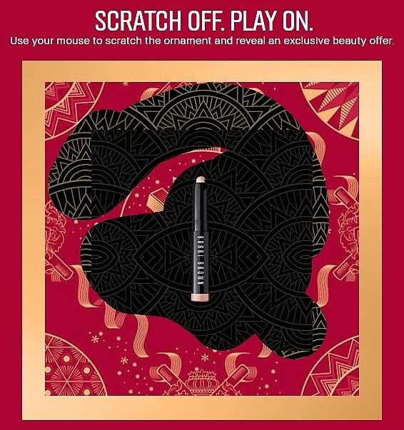
We feel it works either way. You need not wait for AMP technology to make an impact. Still, if you are not sure if scratch cards will work, try incorporating gift boxes in your email.
6. Brain Dead
Our final example is from Brain Dead. The brand collaborated with the American indie supergroup, The Postal Service to commemorate the latter’s 20th anniversary.

The singular newness about this template is its utter lightness given the sentiment of the message. We have come across collaboration emails before. More often than not, these emails tend to get carried away by the force of their announcement.
Brain Dead does something different in their email: they uphold their brand identity while making an exciting announcement, which also involves a second actor, the band — the weight of the template is evenly distributed between the two.
Evidently, throughout this post, we chose examples that illustrate new ideas by way of subtle implementation. From ‘moosletters’ to interactive scratch cards, the success of email campaigns is determined by how quickly the subscriber is made to sit up and rub their eyes.


