All About Fonts & Typography: Typefaces, Kerning and Beyond!
Fonts and typography are integral parts of visual design, and they play a critical role in communicating ideas and messages effectively. The choice of font and typography can make or break a design, impacting its readability, legibility, and overall appeal.
Let's explore the fundamentals of fonts and typography, including typefaces, kerning, leading, tracking, and more.
Typefaces
A typeface, also known as a font family, refers to a set of characters that share the same design and style. Typefaces come in a wide range of styles, including serif, sans-serif, script, and display.
Serif typefaces, such as Times New Roman, have small lines or flourishes at the ends of each letter. These flourishes were originally added to help guide the eye along the text and make it easier to read. Serif typefaces are often used in print design, particularly in books and newspapers.
Sans-serif typefaces, such as Arial, have a more modern, clean look, with no added flourishes. Sans-serif typefaces are often used in digital design, particularly in websites and mobile applications.
Script typefaces, as the name suggests, are designed to look like handwriting or calligraphy. These typefaces are often used in formal invitations or other high-end designs.
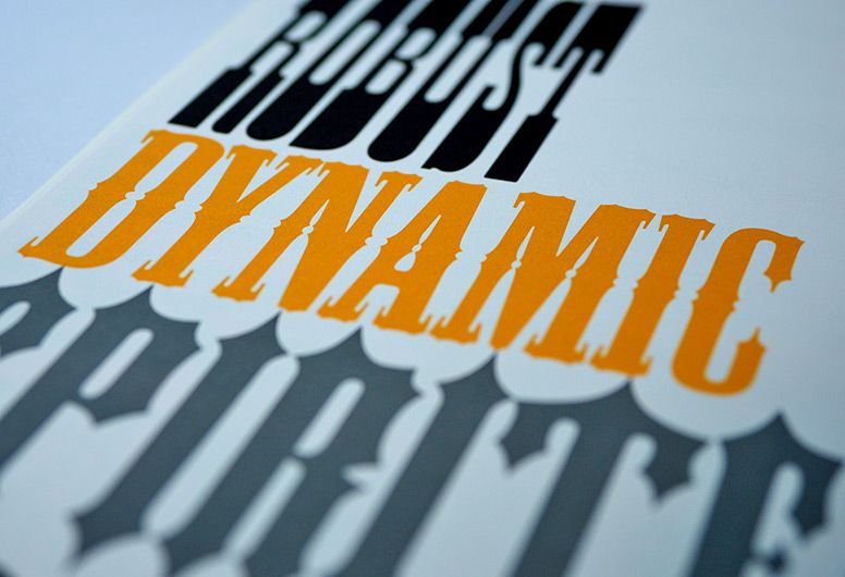
Display typefaces are designed to be used at large sizes, often for headlines or titles. These typefaces are meant to grab the reader's attention and create a sense of drama. Display typefaces often have unique shapes and designs that make them stand out from other typefaces.
Kerning
Kerning is the adjustment of the space between two letters to create a visually pleasing appearance. Some letters, such as "T" and "Y", naturally have more space between them than other letters. Kerning adjusts this space to create a balanced appearance.
Poor kerning can cause letters to overlap or be spaced too far apart, making the text difficult to read. For example, in the word "AVOID", poor kerning might result in the letters "V" and "O" overlapping, making the word appear as "AV OID".
Kerning is especially important when working with large type, or headlines. In these cases, even small adjustments can make a big difference in the appearance of the text.
Leading
Leading, also known as line spacing, is the adjustment of space between lines of text. Proper leading ensures that the text is easy to read and visually appealing.
If the leading is too tight, the text can appear cramped and difficult to read. If the leading is too loose, the text can appear disjointed and difficult to follow. The amount of leading used depends on the typeface, font size, and intended use of the text.
For example, a smaller font size may require more leading to ensure legibility. In contrast, a larger font size may require less leading to ensure that the text is visually appealing and easy to read.
Tracking
Tracking, also known as letter spacing, is the overall adjustment of space between all letters in a word or phrase. Like kerning, tracking can affect the readability and overall appearance of a design.
Proper tracking ensures that text is easy to read and visually appealing. Tracking is often used to adjust the space between all of the letters in a headline or title to create a specific visual effect.
Choosing Fonts and Typography

Choosing the right font and typography for a design is crucial. The chosen typeface must match the tone and style of the message being conveyed.
For example, a playful font would be inappropriate for a serious message, while a formal font would be inappropriate for a fun and playful design. The right typeface can help to reinforce the message being communicated, creating a more effective and impactful design.
It's also important to consider the legibility of the chosen typeface. Legibility refers to how easily the text can be read, particularly in smaller font sizes. Typefaces with thin lines or complex shapes may be difficult to read, especially for people with visual impairments.
Accessibility should also be considered when choosing a typeface. Fonts with good accessibility features, such as high contrast or clear spacing, can make a design more inclusive and accessible to a wider audience.
In addition to considering the style and legibility of the typeface, it's also important to consider its licensing. Not all fonts are free to use, and some require a license or fee to be paid. It's important to ensure that the chosen font can be legally used for the intended purpose.
Typography in Branding
Typography is an important aspect of branding and can play a significant role in creating a recognizable and memorable brand identity. Consistency in typography across all brand materials can create a cohesive and unified look, helping to establish brand recognition.
For example, the Coca-Cola brand is instantly recognizable, in part due to its distinctive typography. The brand's signature script font has remained consistent across all of its marketing materials for decades, helping to establish the brand's identity and create a sense of familiarity for consumers.
Typography in Web Design
Typography is also important in web design, where it can impact the user experience and accessibility of a website. In addition to choosing the right font and typography, web designers must also consider the legibility of the text across different devices and screen sizes.
Responsive web design, which adapts to different screen sizes, can help to ensure that the typography remains legible and easy to read on all devices. Web designers must also consider the colour contrast between the text and background, to ensure that the text is easy to read for people with visual impairments.
Fonts and typography are critical elements of visual design, impacting the readability, legibility, and overall effectiveness of a design. Understanding the fundamentals of typefaces, kerning, leading, tracking, and more can help designers create more effective and impactful designs.
When choosing a font and typography, it's important to consider the style and tone of the message being conveyed, as well as the legibility and accessibility of the chosen typeface. Consistency in typography can also help to create a recognizable and memorable brand identity.
In web design, typography must be considered across different devices and screen sizes, and colour contrast must be considered for accessibility. By carefully considering the typography in a design, designers can create more effective and inclusive designs that effectively communicate the intended message.


